| Hue | Tone | strong> Intensity | Comment | Handled by Chevreul in | Handled by Itten in |
| Fixed | Fixed | Variable | One hue in one tone only but the intensity (saturation) varies as white or black is added to dilute or dull the colour | Harmony of contrast of scale | Contrast of saturation |
| Fixed | Variable | Fixed | One hue and one and the same intensity or saturation, but the brightness or darkness of the hue is varied | Harmony of scale; Harmony of contiguous hues of different tones (when several hues of these properties are considered together) | Light-dark contrast |
| Variable | Fixed | Fixed | For a certain tone and intensity, look at various hues of colours | Harmony of contrasts (very different hues); Harmony of approximate hues; Harmony of a dominant colour | Contrast of hue; Complementary contrast (only between the complementary colours); Harmony definition |
| Variable | Fixed | Variable | Take one tone and then look at all hues that have that same tone, diluted or not with white or black | N/A | Light-dark contrast |
| Fixed | Variable | Variable | All modifications of one and the same hue | N/A | N/A |
| Variable | Variable | Fixed | Take one intensity and look at all colours of various tones and hues | N/A | N/A |
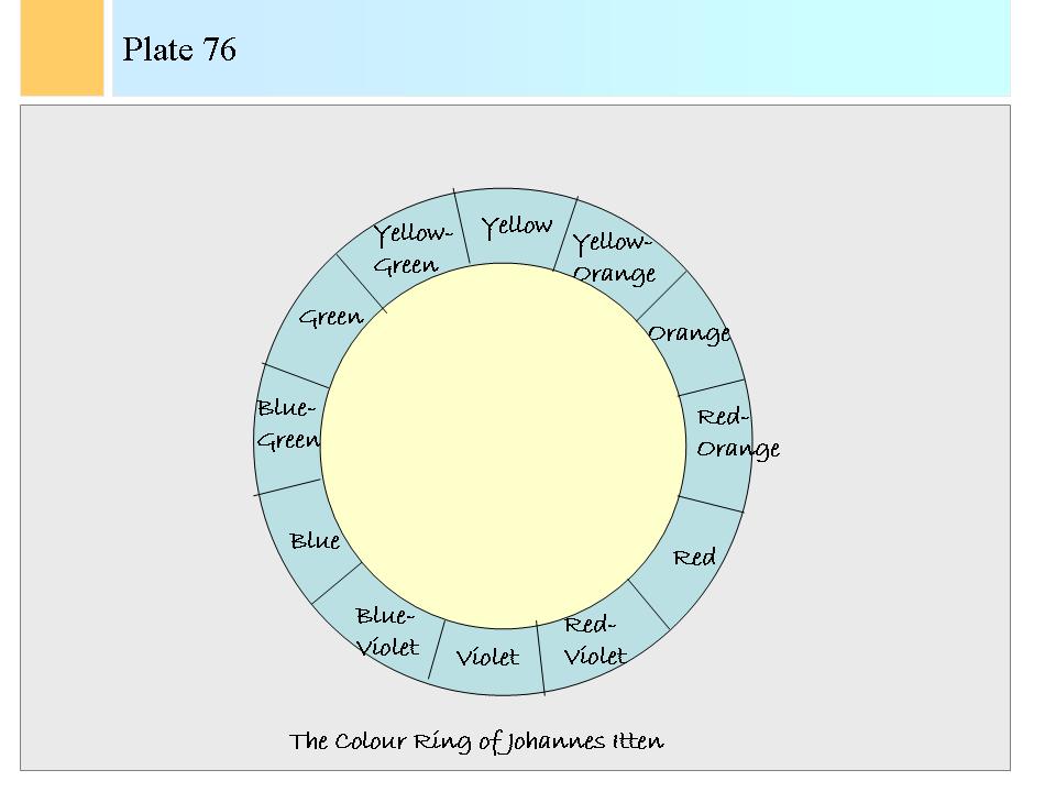
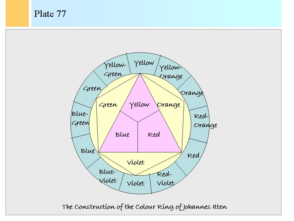
| Combination set 1: | combinations of R, Y and B |
| Combination set 2: | combinations of RY, RB and YB |
| Combination set 3: | combinations within Yr, Yb, Ry, Rb, By and Br |
| Combination set 4: | combinations of R, Y and B with the hues of group 3 |
| Combination set 5: | combinations of R, Y and B with the hues of group 2 |
| Combination set 6: | combinations of hues of group 2 with hues of group 3 |
| Combination set 7: | combinations of hues chosen at random from the three groups together. |