Home Introduction Jesus Mary Apostles Saints Spiritual Themes Genesis Moses Deuteronomic History Educating Arte Full new Screen

Lesson Two – Horizontal Lines


Zeuxis and Artemisia are walking along a small river. It is sunny, but large white and grey clouds hang in the sky.

Zeuxis: After the vertical lines we have to look at horizontal lines. Vertical lines were warm, you said. What do you think about horizontal ones?

Arte: The horizontal lines are colder to me. They make me think of the water one drowns in. I feel passive, at rest and at peace. I think of continuity, of the passing of time. I see inert earth, and dead objects. People and animals lie horizontally when they are dead. Horizontal lines are black and gloomy.

Zeuxis: Draw a few horizontal lines, Arte.

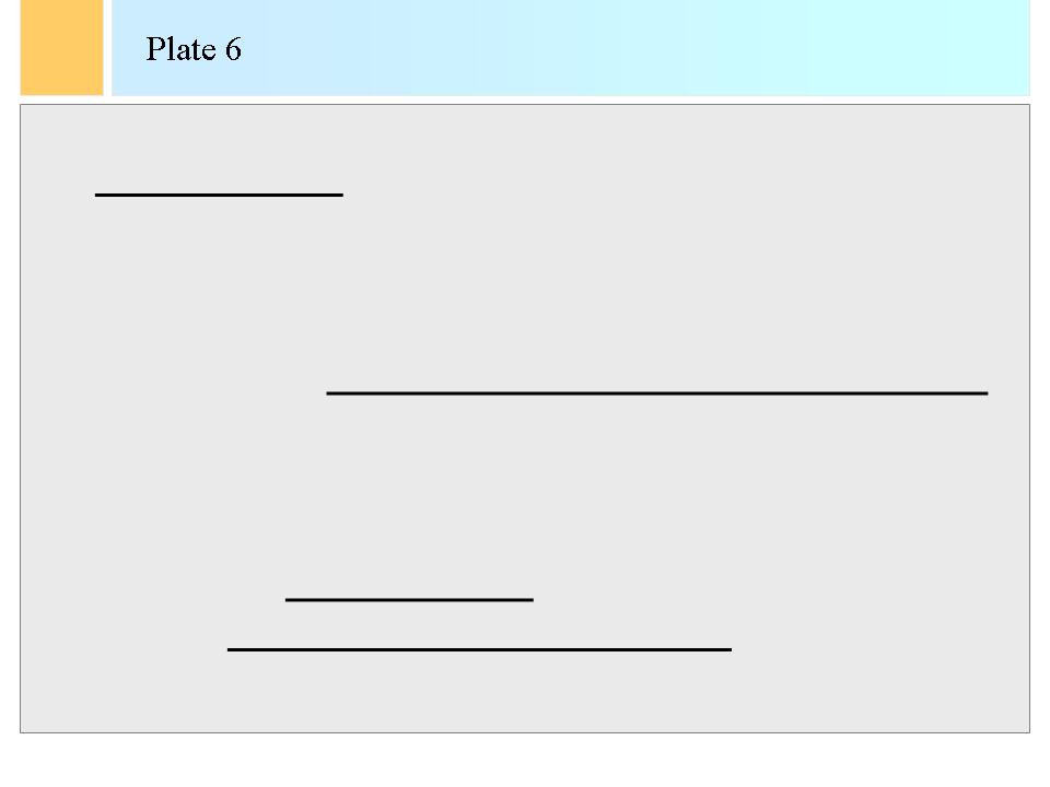
Arte draws the following plate 6:


Zeuxis: Horizontal lines mean the disappearance of forces, and absence of movement. They indicate solidity. They form the basis, the foundations of architectural structures. Abstract paintings often exploit the restfulness and solidity inspired in the viewer by parallel horizontal layers. And, Arte, horizontal lines are also the female principle, the principle of waiting and quietness.

Arte: Ha, ha Zeuxis, you truly make me laugh, you great macho magician! Do you really believe what you are saying, Zeuxis? Waiting and quietness for women? I’ll teach you now! It may be that horizontal lines are the female principle, as you may think we women are inclined to gloom. I definitely do not associate horizontal lines with womanhood. You came from a retarded age, Zeuxis! I’ll show you who gets horizontal when I’m finished with you.

Arte brandishes her little fists. Zeuxis rapidly draws out his magic screen and shows a picture between himself and Arte.

Zeuxis: Hoho. That was just a manner of speaking, Arte. Let’s have a look at what artists have done with horizontals. One can make splendid works of art with just a few horizontal lines, and it was one of the great surprises of the experimentation of the twentieth century abstract art to make this clear. We look at a composition of Marcel Broodthaers. He made several panels on the theme of horizontal lines in 1969 and called them "Un coup de dé jamais n’abolira le hasard. Image". That means "A throw of the dice will never abolish chance. Image". Broodthaers was a poet at first, and later decided to dedicate himself to the visual arts. He was an artist full of irony and one of his best known pieces of art was the "Red Mussels and Pan" of 1965, which was simply a pan filled with mussels in a popular art representation. Belgians just love mussels and French fries, so Broodthaers immortalised the culinary tastes of his fellow-men. With the picture I show you however, he created a composition of randomly juxtaposed horizontal lines. What do you feel when you look at this picture of Broodthaers?

-> Marcel Broodthaers (1924 – 1976). Un coup de dés jamais n’abolira le hasard. Image. Museum voor Moderne Kunst. Koninklijke Musea voor Schone Kunsten. Brussels. 1969.

Arte, calmed again: Well, the horizontal lines are indeed restful. However, I find here quite dynamic patterns. Combining horizontal pieces of line can also create dynamism. Maybe the images try to represent a distant memory of books by this Broodthaers. He was a poet. So the lines may be the memories of the printed words that remained bribes in our minds. Maybe Broodthaers showed his lack of power to create wonderful poetry, so that he only drew the lines of his poetry but not the words anymore. Oh, Zeuxis, is this poetry in lines? It is movement, flow, but also sadness!

Zeuxis: do not advance too far in assuming, Artemisia. But that was good. Now, let’s come back to something I said earlier. Horizontal lines indicate a side. They take the eyes of viewers either from the left to the right or from the right to the left. The intuitive reaction of most Western viewers will be to look from left to right. Right-handedness is an important aspect of physics and of humans. The dials of a clock move clockwise, that is from left to right. A timeline is usually represented from left to right in representations, and most people perceive this direction to be the most natural. Western European Painters have therefore favoured the right side of their frames. However, that is not necessarily the case in other cultures! In George Stubbs’ painting of "Soldiers of the Tenth Light Dragoons", the horse looks to the right and on the right side stand the two soldiers in black towards whom our attention is drawn. The place of honour in this painting is not for the horse on the left, but for the two soldiers on the right. Many other examples of the dominance of the right side can be discerned in paintings. The painter must take account of the fact that the movement from left to right is usually the more natural one for Western viewers. When two shapes of equal size are shown in the same place relative to the borders of the frame, but one to the left and the other to the right, the one on the right will seem somewhat larger. This effect also is due to the preference for the right side of humans.

-> George Stubbs (1724 – 1806). Soldiers of the Tenth Light Dragoons. The Royal Collection. London. Around 1793.

Arte: All right, Zeuxis. Now that we walk, look at how fine the meadows are this time of the year. The grass is never greener. I think of something else. The horizon is horizontal!

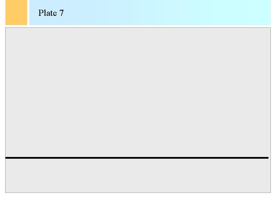
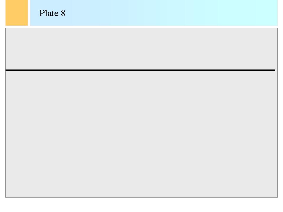
Zeuxis: Oh, yes. I was forgetting that. A major line in landscapes is the horizon. Thus, horizontal lines mean wideness, breadth, and vastness to left and right, as they may remind of the horizon. Let’s talk a bit of technique now. The place of that line in a picture of nature, in landscape paintings, defines the position of the viewer. If the line is in the exact middle of the canvas, the viewer is in a neutral position. If the horizon line is low, dominance is given to the sky. This heightens the impression of weight of the heavens and of smallness of man. The scenes are then more intimate, and one can expect more dense narrative and pictorial elements in the picture. If the horizon line is high, the main scene and the views will probably oversee a vast, wide land space, at which the spectator will look from a lower point of view. Try it out, Arte.
Arte draws a few horizon lines: a low horizon in plate 7 and a high horizon in plate 8.


Zeuxis: Horizontal lines were preferred by the nineteenth century Impressionist landscape painters and by the Realist painters of the schools of Barbizon and of The Hague. Not just these realist painters worked with horizontal lines. Much earlier already, Dutch artists of the seventeenth century used dominance of horizontals in landscapes to enhance the feelings of the vastness of the open views of their country, which was the flat, alluvial plain of the delta's of the Rhine and Meuse Rivers. Jacob van Ruisdael, one of the finest Dutch landscape painters of the seventeenth century, made a picture called "View of Haarlem" around 1670. Van Ruisdael placed the horizon low to indicate the flatness of The Netherlands, the wide views on the country and the smallness of the little towns in the vast wideness of space.

-> Jacob van Ruisdael (1628 – 1682). View on Haarlem. Rijksmuseum. Amsterdam. Around 1670.

Arte: Look, Zeuxis, I drew a horizontal line on these two sheets of paper. And I see a complete landscape indeed. Here is a low horizon and there a high one.

Zeuxis: Your words have a strong suggestive power to me too, Arte. You draw a line and you speak of horizon, so I see a landscape. I see a low sea and a large sky, and exactly the opposite in the second drawing. Painters cannot speak out to their audience – well, they rarely do so – but they can use the title to be suggestive like this. Look at the picture I wanted to show you next.

Zeuxis projects a marvellous landscape, not unlike the one Arte and him are walking in.

Zeuxis: An admirable example of this kind of use of horizontal lines is in Gino Severini’s picture "Landscape in Civray", painted in 1909. Severini shows meadows separated by hedges and the hedges run horizontally. The hedges are painted closer to each other as they reach the horizon. This enhances much the impression of perspective in the painting.

-> Gino Severini (1883-1966). Landscape in Civray. Private Collection Rau. Germany. 1909.

Arte: I understand that horizontal lines are necessary, for they are the basis on which all living things stand, but they are also somewhat repulsive to me. Horizontal lines emphasised too much in pictures set me ill at ease. I perceive a menacing influence, and feelings of smallness. I feel some of these impressions when viewing Jacob van Ruisdael’s picture you showed me before.

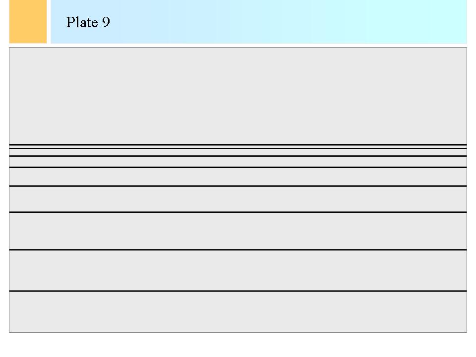
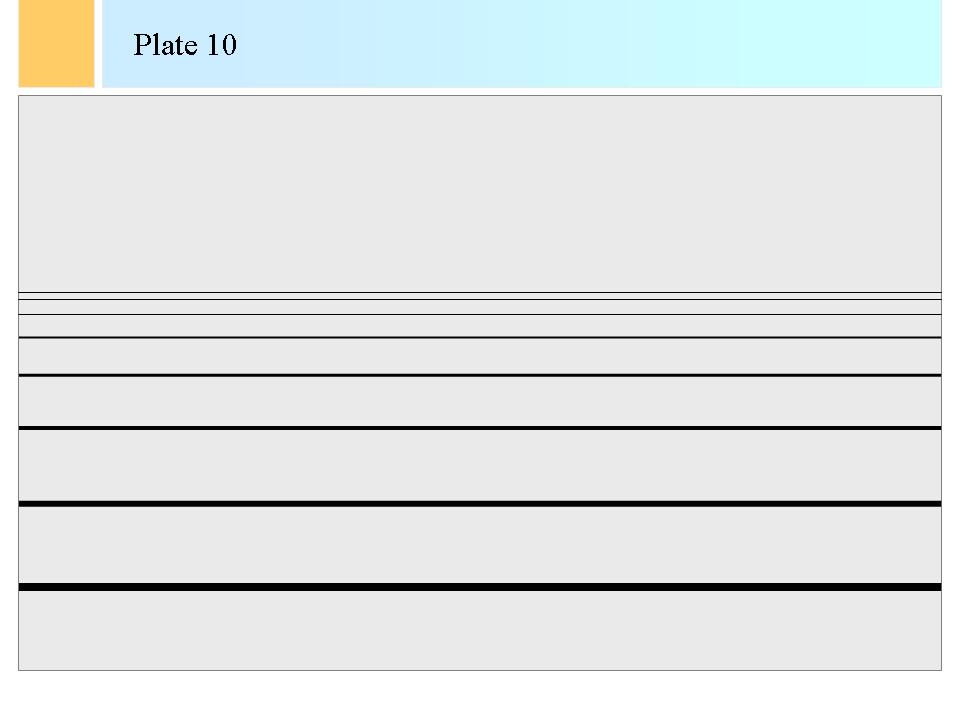
Zeuxis: Let’s continue further on these horizon lines now. Let’s amplify the effect. Several parallel horizontal lines starting from the lower part of a frame and at an ever closer, that is shorter distance from each other, stopping halfway in the frame, create a sense of depth in a picture. Such a set of lines creates an impression of an opening landscape that flees to a horizon. Horizontal lines are much used in landscape paintings for the effect of flatness and wideness of the land that they carry. The grand landscapes of the Dutch landscape painters of the seventeenth century come immediately to mind, but also Dutch marine pictures. Jacob van Ruisdael also indicated several horizontal lines, which start wide apart and come closer together near the horizon in order to create illusions of depth and great distances. Here also the painter can put thicker lines close to the viewer and thinner lines further away. Try it out, Arte.

Arte draws the plates 9 and 10.


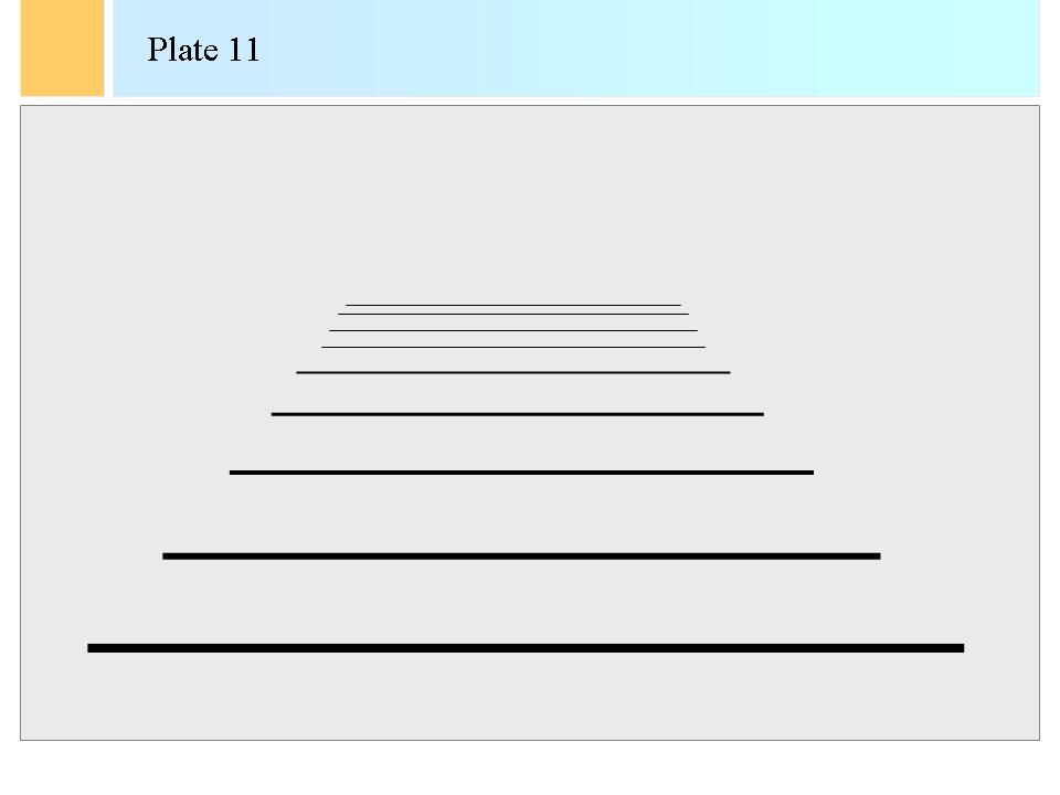
Zeuxis: Using longer lines at the bottom and shorter lines higher up can enhance the effect of fleeing horizontal lines. The ends of these lines then form a pattern of perspective that recedes to an eye-point. Painters can exploit this feature to add subject matter on the left or right and thus create ever more powerful effects of receding space and of depth in a painting. Invisible but strongly suggested slanting lines that recede to the far create this impression more strongly, as is the case with the impression of perspective created by the shortening vertical lines. Try it, Arte.

Arte draws plate 11:


Zeuxis: If we look again to Gino Severini’s ‘Landscape in Civray’, we see also these effects very subtly applied.

Zeuxis projects again Severini’s landscape.

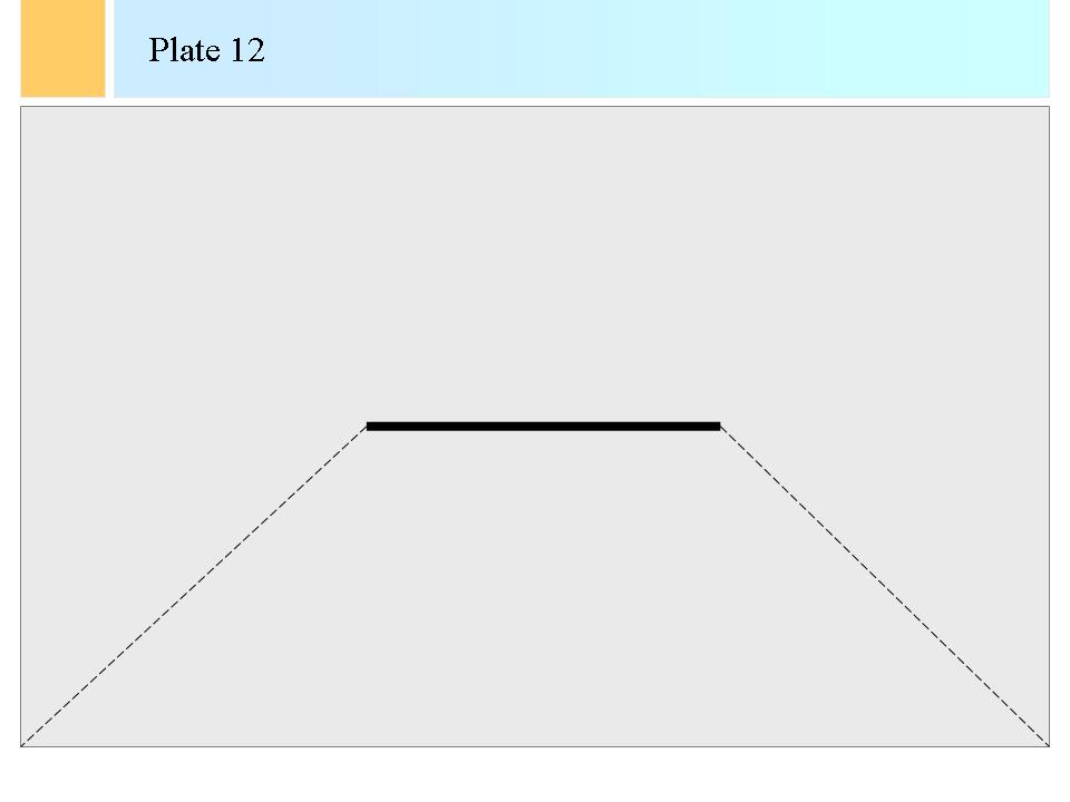
Zeuxis: Severini painted more trees to the background and thus shortened the horizontal lines of the hedges, as they are painted further away from the viewer. In this way the viewer has a strong impression of a wide-open field and then his or her view is restricted towards the horizon. The effect of the horizontal lines growing smaller adds to the perspective. Moreover, since the horizontal lines converge, the spectator also perceives oblique lines that recede to a vanishing point on the horizon. These oblique lines are present in the painting, but only very slightly, on the left and the right. They limit the front open field, but Severini added them especially in the front part to enhance perspective close to the viewer so that perspective and depth is enhanced there too. Remark furthermore in this painting the high horizon and the horizontal lines in the clouds. The high horizon adds to the impression of depth and wideness of the scene, whereas the long series of clouds enhance the general horizontality of the landscape. We can further modulate this depth, as I told earlier, by applying thicker lines close to the viewer and thinner lines further off. Can you draw the "invisible receding lines", Arte?

-> Gino Severini (1883-1966). Landscape in Civray. Private Collection Rau. Germany. 1909.

Arte obediently draws also the oblique, invisible lines of perspective of plate 11 on a new sheet of paper, to plate 12:


Zeuxis: Fine!

Arte: Zeuxis, do painters use horizontal lines often? You keep talking and talking about them, but there must be more in painting than these boring lines.

Zeuxis: Except for their use in landscapes, painters use horizontal lines sparingly. These lines tend to divide a picture in layers and thus focus the attention of the viewers separately to each of the layers, which is not always an effect that painters desire since it may destroy the unity of representation of a picture. But of course, such division in bands is sometimes indeed a salient feature as in some of Paolo Veronese’s scenes for instance. Horizontal lines can thus be used to divide a frame in layers, in which then various scenes are painted.

Arte: Who was Paolo Veronese?

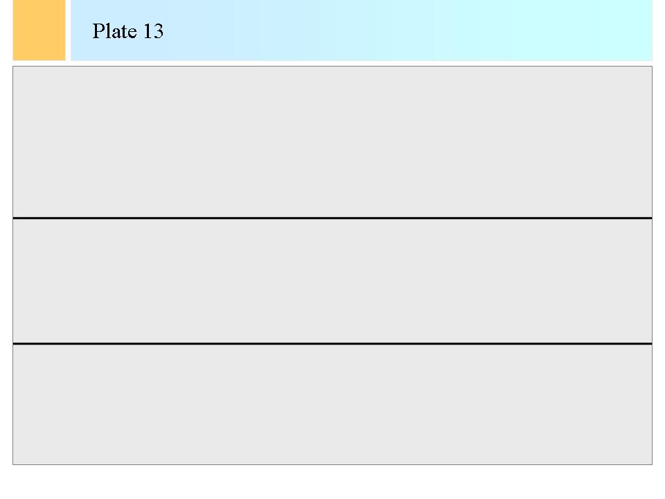
Zeuxis: A painter of the seventeenth century of Venice. Actually, he originated from Verona, hence his name, but he worked in Venice mostly. Please draw two equally distanced horizontal lines, Arte, to give us an idea of three frame layers.

Arte complies in plate 13:


Zeuxis: Great! In Paolo Veronese’s pictures we may have a scene with a dressed table below, a long balcony with further action in the middle and in the third, the highest layer, Veronese used to show the cloudy sky with architectures of buildings and towers to form the stage setting. Strong, long horizontal lines have been so rarely applied by painters in scenes that their re-introduction could come as something of a shock, as a new original idea in representation. Look for instance at "Christ in the House of his Parents" of Sir John Everett Millais (1829-1896).

Zeuxis projects a completely different picture now.

Zeuxis: In this picture the horizontality of the table together with the vertical directions of the figures brought a surprising view and unusual feelings into a well-known religious theme.

-> Sir John Everett Millais (1829-1896). Christ in the House of his Parents. The Tate Gallery. London. 1850.

Arte: That is a surprising picture, Zeuxis. We have been walking for a long time now and I see my house again, there. Can we stop this lesson?

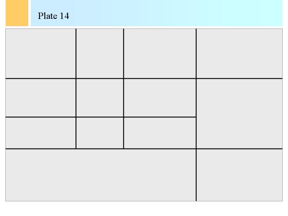
Zeuxis: While we are going back to your home: just a last point. In these first two lessons we briefly discussed vertical and horizontal lines separately. The aspiring verticals and the solid horizontals can be combined, and have been so to constitute one of the main tendencies of abstract art of the twentieth century. Combinations of horizontal and vertical lines give an impression of inflexibility, of frozen rigidity. Structures composed of horizontals and verticals do not move and cannot be distorted when the lines are fixed together. This is the most elementary combination of lines to form areas in a picture. Piet Mondriaan and the artists of the Dutch school called "De Stijl" based their views of architecture on such constructions. The combination of strong dark, straight lines meant in the ideas of De Stijl the true representation of the dominance of reason in art. With the combinations of horizontals and verticals, basic squares and rectangles could be formed, which were sufficient in architecture. The combination gave an impression of pure utility and of areas really invented by man since such pure rectangles did not exist in nature. Look, Arte, give me a sheet of paper and I’ll show you.

Arte hands over a crayon and a sheet of blank paper. Zeuxis starts drawing plate 14.


Then Zeuxis positions his screen again and he shows pictures, more talking to himself than to Arte now. Arte looks at him in amazement.

Zeuxis: Piet Mondriaan’s style of the coloured rectangles did not evolve at once. Interestingly, one can follow an evolution in his art from small horizontal and vertical lines in the beginning, to the totally structured pictures of his later periods. His painting ‘Tableau III (Compositie in ovaal)’ dates thus from 1914. Remark indeed the oval form, Arte, a form that could not find grace in later views of De Stijl. This picture is a combination of small pieces of vertical and horizontal lines between which Mondriaan painted soft colours. From 1928 however dates ‘Compositie met rood, zwart, blauw, geel en grijs’ and this picture is the final accomplishment of "De Stijl" ideas.

-> Piet Mondriaan (1872 – 1944). Table III (Composition in oval). Stedelijk Museum. Amsterdam. 1914.

-> Piet Mondriaan (1872 – 1944). Composition with red, black, blue, yellow and grey. Stedelijk Museum. Amsterdam. 1928.

Arte: Zeuxis, Zeuxis. You come from far Greece but you are in passion over abstract art.

Zeuxis: Yes, Arte. Abstract art is great to explain concepts of painting.
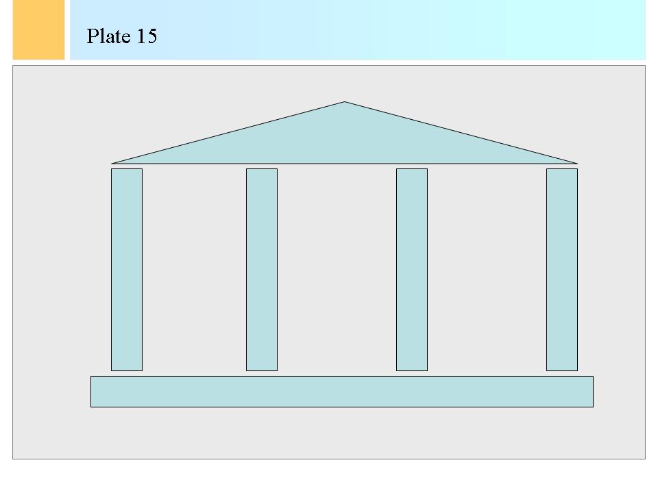
One last thing. I just have to tell you this! A combination of forms that is much used in architecture, and hence often represented in paintings, is the Palladian front. This was a classical element of design re-invented or re-used by the Italian architect Andrea Palladio (1508-1580). Palladio used a front for his palaces that consisted of four slender columns topped by a long and narrow triangle. The vertical columns give an impression of elation, of aspiration towards the heavens, and hence evoke spirituality and transcendence. The slanting lines of the triangle also point to the sky and enhance the effect. Such feelings impress viewers, visitors to the Palladian palaces, so that they stand in silence before the classical dignity of the front. So look, we made a sidestep from paintings to architecture and you see, the same principles of design apply to architecture.

Zeuxis draws plate 15.


Arte: That was all nice, Zeuxis. I see that you can draw too. But I am home. Here we end with this lesson!


Copyright: René Dewil Back to the navigation screen (if that screen has been closed) Last updated: May 2010
Book Next Previous

Copyright: René Dewil - All rights reserved. The electronic form of this document is copyright. Permission is granted for electronic copying, distribution in print form for educational purposes and personal use. If you do reduplicate the document, indicate the source as 'René Dewil - The Art of Painting - Copyright'. No permission is granted for commercial use and if you would like to reproduce this work for commercial purposes in all or in part, in any form, as in selling it as a book or published compilation, then you must ask for my permission formally and separately.