Home Introduction Jesus Mary Apostles Saints Spiritual Themes Genesis Moses Deuteronomic History Educating Arte Full new Screen

Lesson Fifteen – Volume and Space


Arte and Zeuxis are sitting in Arte’s home. It rains abundantly outside. Arte has a towel around her head and she has changed her dress.

Zeuxis: Sorry, Arte. Rain doesn’t hurt me so much as you. I was not really aware. Shall we continue?

Arte, puffing: Please do, Zeuxis.

Zeuxis: All right. Let’s change subjects. We need to talk about volume and space, two new concepts.

Zeuxis: I have already talked previously about some means of creating volume and space. Thus I spoke of the "Open V", which opens the view of the spectator, a traditional way of creating space in a picture. I also spoke of chiaroscuro shadowing to show volume, especially on figures, and on objects, although the objects are depicted on a completely flat two-dimensional canvas or wooden panel. These means created an illusion of three dimensions.

Arte: I remember, Zeuxis.

Zeuxis: Humans see the three-dimensional aspects of objects because of a phenomenon of vision called "binocular disparity". Humans have two eyes, and these are set in slightly different positions in the face. Therefore, the images of an object on the retinas are not exactly the same. The brain combines the two slightly different images, and converts the differences into a sense of space and depth, of three-dimensionality.
Paintings are made on a flat panel or canvas, so creating volume, space and depth in a picture is creating an illusion of reality. Yet, when an artist places colours or lines and shapes on the panel, he or she cannot avoid effects of space. A painter who colours half a panel in red and half a panel in blue, will create an effect of space, for the warm colour will seem to come close to the viewer whereas the blue colour will form a shape that recedes. Therefore, two separate planes in slightly different positions of an undefined space will be created, showing an effect of depth.
Amédée Ozenfant (1886-1966) once wrote that the only way to paint a two-dimensional picture was to paint a surface plane in one single colour. Colouring thus is immediately creating space and depth!
When a painter positions even the simplest geometrical shapes on the canvas, he creates space. The lines of a circle, of a triangle or ofa square, all form a closed shape, and this shape is perceived as an object placed against a background. The shape of the object is therefore suddenly lying in another plane of space. Thus, merely showing such a form by lines that close up on each other to a shape creates space. Moreover, when a painter draws two shapes closely together, he or she can draw the shapes as overlapping. The shapes then even more are perceived as different objects situated in different positions of depth.
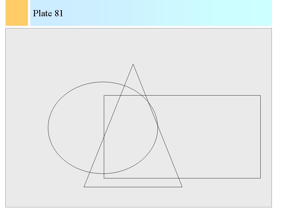
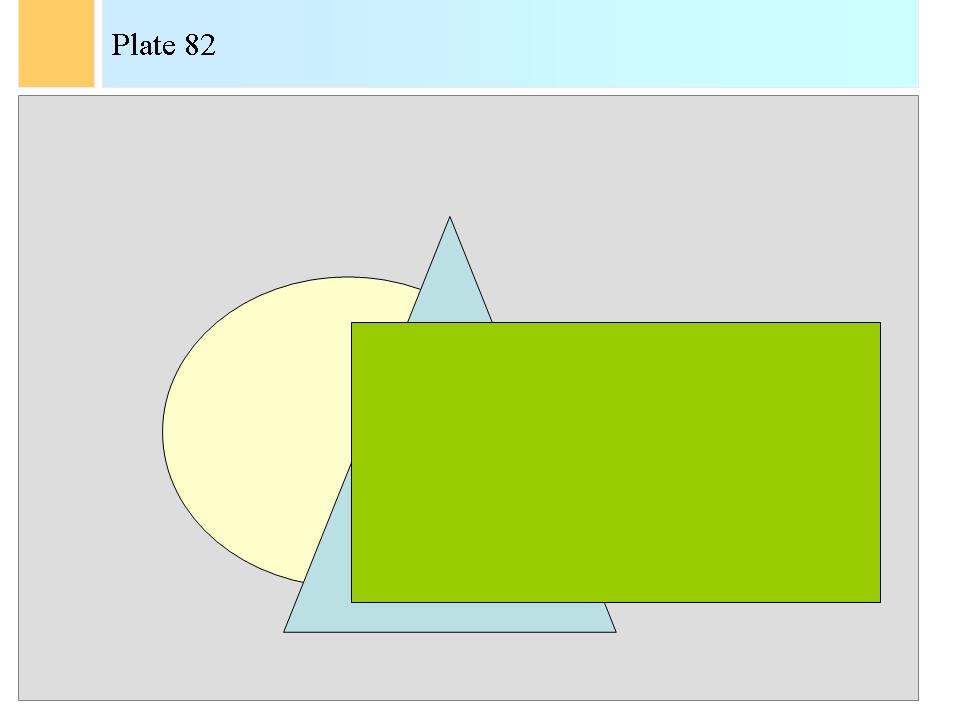
Depending on how we draw the lines of the shapes, we can emphasise the two-dimensionality of a representation or its three-dimensionality and thus space. Look at the two following figures.

Zeuxis takes a piece of white paper out of his sleeves and he draws plates 81 and 82.


Zeuxis: In the first drawing, the lines overlap and emphasise the flatness of the canvas. Any viewer will be puzzled by this representation, as he or she immediately perceives the difference in space between the drawn lines and the background, but the viewer would expect also some lines to be hidden. As the lines are not hidden, the shapes violate space, and that is in contradiction with their being different from the background. In the second picture, harmony and a sense of reality is restored. Here, space and depth become acceptable, credible and with the most frugal means the painter has created a feeling of three-dimensionality on the two-dimensional canvas.

Zeuxis: When we looked at such simple pictures, I spoke of shapes and background. I called background, as a notion of space, the larger shape of the frame of the canvas. The "background" thus becomes the "universe" in which the objects are positioned.
So, painting shapes on a panel introduces depth as one shape is put wholly or partially on top of another.
Even in the abstract pictures of Kasimir Malevich, which consist only of the primary forms such as squares, rectangles and triangles, a strong sense of space is created. The same can be said of Mondriaan’s paintings of vertical and horizontal patterns, as also in these pictures the lines overlap, and thus evoke a feeling of various planes in space.

Zeuxis pushes his magic screen against the wall and shows a picture of Maria Elena Vieira da Silva.

-> Maria Elena Vieira da Silva (1908-1992). The Theatre of Gérard Philippe. Le Musée d’Unterlinden. Colmar. 1975.

Zeuxis: As an example of an abstract picture that creates a very powerful feeling of space and depth, we show a picture of Maria Elena Vieira da Silva (1908-1992), a well-known Portuguese painter.
In her painting, Ms Vieira da Silva used patterns of lines that resemble perspective of receding lines. We will come back in next chapters on these patterns of perspective. She also used two colours, blue and black, plus the white as a background. The black lines seem to be painted on top of the blue lines, so that the black structure seems to be closer to the viewer, like the curtain of a theatre, than the blue scene that opens far. Over the whole picture, the viewer can find planes that intersect, and that seem to be placed on in front of the other.

Arte, proudly: This Maria Elena was a wonderful painter! She had a fine imagination. You always show me pictures made by men. I am very happy that you showed us a picture made by a woman for once.

Zeuxis: Oh, there were many female lady painters in history, Arte, and there are even more in your days. But that is another subject. I’ll continue.

Zeuxis: The American art critic Clement Greenberg summed up the view on space in modern abstract art as follows in an article of 1960: "The first mark made on a surface destroys its visual flatness, and the configurations of a Mondrian still suggest a kind of illusion of a kind of third dimension. Only now it is a strictly pictorial, strictly optical third dimension. Where the Old Masters created an illusion of space into which one could imagine oneself walking, the illusion created by a Modernist is one into which one can only look, can travel only with the eye. " G86 .
Maria Elena Vieira da Silva’s work is such a work completely, as it shows a strange new space that although painted on a canvas invites to a walk in the far. But that space is not the natural one that the viewer has experienced in his normal life. It is a space of imagination, as only could be created by a human in his or her mind.
In Western European art, various means were used to depict volume, depth and space and I would like now to present these to you, starting with volume.

Arte, expectantly: Go ahead, Zeuxis!

Zeuxis: Figurative painting is the representation on a flat panel, and thus in two-dimensional space, of objects that have three dimensions. Real objects of nature have length, width and depth. This representation always presented specific issues to the artists. Painting could never be the exact reproduction of the object; it always remained merely an image of the object. Representation in painting is always an illusion. The illusion can be made as good as possible so as to be almost perfect, but the image will always be an illusion. There is no escape to that trivial statement, however many painters have tried to better the illusion.

Zeuxis continues: Painters can create an immediate illusion of space by overlapping the forms they draw. One of the nicest and also earliest examples I know of this technique is in a triptych made around 1330 by Bernardo Daddi (ca. 1280-1348). He painted a triptych with the Virgin Mary in the middle panel, flanked by the Saints Tomas of Aquino and Paul. Beneath the Saints is a narrow frieze and beneath Mary the frieze is larger and becomes a wooden inlay panel that looks like a balcony. The illusion of the balcony is strengthened because Mary lowers her hand, "over" the balcony, to point to something beneath, to a predella or to the altar on which stood the triptych. Daddi painted a double illusion: an illusion of a wooden inlay panel and the illusion of a balcony. Mary’s hand goes from the space of the painting into the space of the spectator.

-> Bernardo Daddi (ca. 1280-1348). The Virgin Mary with the Saints Paul and Thomas of Aquino. The J. Paul Getty Museum. Santa Monica (Los Angeles). Ca. 1330.

Zeuxis projects a picture of Caravaggio to Arte.

-> Michelangelo Merisi called Caravaggio (1571-1610). The Basket of Fruit. Pinacoteca Ambrosiana. Milan. Around 1594 to 1598.

Zeuxis: A young painter who really tried very much to make the illusion perfect, was Caravaggio. We show the basket of fruit he made around 1594 to 1598 and that is of such naturalism that flies vainly tried to touch the fruit.
Remark the delicate chiaroscuro in the fruit in the basket, perfectly applied to great skill to imitate the effects of natural light. Remark also how skilfully Caravaggio applied shadowing and the play of light on the basket of woven reed. This basket is actually a very complex object for light, since light falls in highlight on certain threads, and in various degrees of shadowing on others. The gradual changes from highlight or shadow are also masterly shown on the grapes.
Knowing that the representation of objects remained an illusion, always led to various reactions by painters who were inclined to experiment. In inventing new techniques however inadequate, various schools and styles in painting emerged.
The painters could, like the early Caravaggio, try to show the illusion as perfect as possible. But more revolutionary techniques were discovered also. The painters could glue three-dimensional objects on the canvas, as some Pop-art artists did. Or painters could fully abandon themselves to the illusion. Then they created pictures like the "Pittura Metafysica" and the imaginary environments of Surrealist artists, of imaginary objects, super-natural combinations of objects and images. Painters could also use the means of the visual arts as an end in itself, that is apply line for line’s sake, form for form’s sake, colour for colour’s sake. But in the first centuries of fresco and oil painting, which were centuries of figurative painting, the question on how to represent volume on a flat surface was a problem that was not easily resolved.
There was a conflict between what the eye saw and what the mind knew as to be reality. The problem was to determine how one should represent an object. Should one represent the object on the frame as it was seen, and then face the issue of the object not being recognised by the viewers? Or should one paint the object, as one knew it by one’s mind from having touched it, turned it in space and knew logically how the object really was?

Zeuxis: The Egyptian artists tried to solve the problem by using several techniques. They showed various views of figures in the same image. The face of a pharaoh was drawn in profile, but the eyes were shown in full as if seen from the front. The legs of the figure were drawn one in front of the other but in the same line, that is one leg not behind the other but in the alignment of the first. The Egyptians artists did the same with the arms of figures in pictures of hunting, fishing or fighting. Yet, in later Egyptian painting, we find already an evolution whereby one foot is painted behind the other in a better comprehension of volume and space. In the picture of a pond, the flowers, bushes and trees that surrounded the water were painted perpendicular on the sides of the pond, instead of situated in front of each other in space. In Egyptian paintings, shadows are absent and volume of figures or animals only indicated in bas-relief pieces of art. Here we had an art that tried to address the issue of the representation of three-dimensionality without chiaroscuro. That was a fascinating technique.
When painters began to see more and more of these images in archaeological museums and came to understand that other techniques but chiaroscuro could exist to show volume, a long period of new experiments started, which led to Cubist art. It was recognised that representation of an object in such a way that the object was well recognised, could take many forms.


Shadows

Zeuxis: The most important and traditional technique to show volume was the chiaroscuro that we have described earlier in this text. Chiaroscuro is the technique whereby shadows, that is darker colours, are applied to certain areas in the painting so that an illusion is created of light falling in from a certain angle or side of the frame. The shadows create an illusion of depth and thus of space, particularly when applied to images of architectural constructions.

Zeuxis shows Arte the picture of Gerrit Berckheyde.

-> Gerrit Berckheyde (1638-1698). The Large Square of Haarlem. Le Musée d’Art Ancien. Brussels.

Zeuxis: A good example of the use of shadows on architectures in order to create the strong illusion of volume, is Gerrit Berckheyde’s image of the central square of Haarlem. Berckheyde showed more the church and the old, typical houses of the place than the square itself. Furthermore he chose a scene in a late or early sun, when the sun is low, throwing long shadows of the buildings and of the people on the hell-lit pavement. The effect of the shadows is dramatic and creates a perfect illusion of depth and of reality.

Shadows are a very simple fact of observation, but they can become extremely complex for painters to imitate, especially when they design a painting from their mind and do not face a real scene.
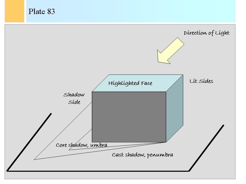
Take a cube placed on a flat surface. When light falls from above and sideways on the cube, the face of the cube that is closest to the light will be the most lit. This is the highlighted face. Then, some of the sides of the cube will also be lit, in the direction of the source of light. But since the distance to the light source diminishes, less bright reflections will reach the eye. The viewer will only see part of these changes in brightness unless he or she stands exactly between the cube and the light source. The half part of the cube on which light does not fall directly will be in shadow. The cube also will throw a shadow on the flat surface. Just behind the cube, there will be a very dark zone that receives no light at all. We call this the core shadow. With a cube this is a double triangle zone, right behind the cube.
Then, as we assume the light to be a large source, some part of the surface around the core shadow will also receive some light but not much, and form an additional zone of shadow on the surface. This will then be the total shadow cast by the cube on the surface.
A small, point light source or a distant source will cast a sharp shadow. A near source, a large source or a source of diffuse light will throw a shadow in a dark zone that receives no light, a zone called the "umbra", and it will cast a shadow in a lighter outer zone that will receive some light from parts of the source; this zone is called the "penumbra".

Zeuxis draws plate 83 now, and that takes some time. Arte looks interestingly at what he does.


Zeuxis: This seems like an extremely complex example, Arte, but it is actually more like a very easy one. Few forms of nature are cubes or elementary volumes like pyramids, prisms and the like. It is hard to construct geometrically correct shadow forms cast on objects and surfaces. It is all the more difficult for a painter to imagine the result by intuition. Imagine the complexity of light falling on a sphere! Then due to the round volume of the sphere, light will gradually fade from a point highlight zone, the closest point to the light source, to the shadow zone. We can add to the complexity by giving different textures to the sphere.

Zeuxis: Close your eyes now, Arte, and imagine light falling on complex shapes such as the human figure.

Arte complies and Zeuxis continues: Each time the painter has to think of the gradations on very many areas from highlighted zones (there will be more than one for the human figure), to zones that receive less light because they recede, and to core shadow and cast shadow.
We have now only had in our imagination flat surfaces, but these also can change in shape, and thus equally receive highlighted and shadow parts. Determining purely by imagination the highlighted surfaces, the lit surfaces, the core shadows and the cast shadows for a complex three-dimensional form is a daunting task for a painter!

Zeuxis: You can open your eyes again, Arte.

Zeuxis continues: The painter must have seen the effects, retained all the details in his head, in order to give a truthful representation of a real scene lit by light. Then enter all the possible hues of the forms and of the backgrounds on which the shadows fall. These hues change from minute area to minute area. The surface on which the shadows fall may not be flat but be a broken surface or a flat surface with water. The source of light may be a large source that sends uniformly light to the scene, but the source can have other characteristics. It may be a faint light that fades rapidly with distance. It may be a point source. When the light comes from a point source, shadows are very sharp, whereas the shadows will be very gradually with larger sources.

Zeuxis waits a while, and then he continues: I have devoted little words in my lessons to the art of engraving or of drawing in one colour tint. I concentrated on tempera and oil painting and on frescoes. In black-and-white drawings, applying shadows is called shading. In shading, close and parallel black lines can be drawn in the zones of shadows, crossed over in the darker core shadow zones, and maybe even thick lines can be used there. The draughtsman can obtain the gradual transition from core shadow to casted shadow by drawing lines less closely, less dense and thinner.

Zeuxis: The preceding example showed what happens with white light falling on a white cube placed on a white surface.
The cube could however be green and the surface white. The cube could be green and the surface blue. The light could be orange instead of white.
A few simple rules however rule over the colour changes!
Rule number one says that when coloured light falls on an object, that colour of light combines with the colour of the object.
Rule number two says that the shadow zones take the complementary colour of the surrounding colour.
With these two rules, we can make up the following table of the various colours for light falling on an object.

Read the table row by row!
When coloured light falls on a surface, the resulting colour depends from the colours of the light and from the surface. In theory, the colours do not combine; in reality, they do.
Indeed, suppose we have a green surface on which an orange light falls. The green surface only reflects the wavelengths of light corresponding to green, so that if pure orange light falls on that surface we would see only black, since all yellow and red light would be absorbed by the perfect green surface. In reality, no surface is perfect in reflecting only one wavelength, and no light source is perfect in sending but one wavelength. Usually any surface will more or less reflect also other wavelengths and the light source will also contain other wavelengths of light, exemplified in white light.
So, when orange light from a not so perfect light source falls on a not so perfect green surface, some of the minority green of the source will be reflected well, and the surface will also reflect some of the yellow and red that fall on the surface. The result can be anything from a sombre brown to a sombre violet, depending on the properties of the light and the surface.
In the following table I pre-supposed imperfect light sources and surfaces. Look at how complex the colouring differences are, Arte!
Painters rarely think almost mathematically at shadows. They either look and copy more or less faithfully, or they simplify. After all, the exercise to determine the righ tcolour sof shadows is as difficult for viewers as for painters!

Arte: I can imagine, even with open eyes, Zeuxis!

Zeuxis fills in a table, plate 84, for Arte.

Light Source: White White White Orange Orange Orange
Cube: White Green Green White Green Green
Surface: White White Blue White White Blue
. . . . . . .
Highlighted Face Bright White Bright Green Bright Green Bright Orange Bright Brown hue Bright Brown hue
Lit Sides White Green Green Orange Brown Brown
Shadow Sides Grey Reddish Grey Reddish Grey Orange shaded Grey Brown tinted Grey Brown tinted Grey
Core Shadow Black Reddish Black Orange-tinted to yellowish Black Violet tinted Black Violet tinted Black Dark orange tinted Black
Cast Shadow Grey Reddish Grey Orange-tinted to yellowish Grey Violet tinted Grey Violet tinted Grey Orange tinted Grey
Surface White White Blue Orange Orange Violet hue


Table - Plate 84


Foreshortening

Zeuxis: On to our next subject, Arte: foreshortening!

Zeuxis: Painters knew that figures and objects further away from a viewer shrink in length. This effect could be used for instance in background images of Gothic paintings, to give a gradual impression of the far. It sufficed to draw a landscape with houses and figures, and to draw these gradually smaller as they reached the horizon. The effect was powerful, and it created astonishing depth of space.
This can be noticed in the painting of the Van Eyck brother, the panel of the "Three Maries at the open Sepulchre" of which we wrote earlier. In this panel, the town of Jerusalem is far off. The buildings and walls of the city are much smaller than the figures of the foreground.
We already discussed the effect of vertical lines that became smaller towards the middle of the canvas in earlier chapters. And also horizontal lines that were parallel to the viewer on the canvas, could grow shorter while reaching the centre and sequences of horizontal lines that come nearer to each other near the horizon can generate effects of depths.
Furthermore, details blurr at a distance, and thus create a powerful feeling of perspective. Contrasts between colours disappear with distance. Distant objects are seen in less detail, less distinct outlines and with less sharp lines. These effects also can be exploited to indicate distance.

Arte: What then is foreshortening, Zeuxis?

Zeuxis: A particular change in the length of the parts of objects or of figures due to distance is called foreshortening.
Foreshortening is a technique to present objects in depth, whereby the parts of the object closer to the viewer are larger than the parts that are further from the viewer. We already saw somewhat of this foreshortening for separate objects that are at further distance from the viewer, but the effect of foreshortening plays directly on one object too.
The effect was not obvious for painters. It meant that for the figure of a naked person lying down on the ground with his or her feet close to the viewer, strange images had to be drawn. For the feet had to be shown much larger than the head of the person, and that was intuitively wrong again, since the painter’s mind, as well as the viewer's mind, told that the head was at least as large as the feet. Yet, reality of vision dictates that the closer the feet, the larger they had to be painted. Gradually, painters gave in to the reality of their eyes’ vision, and the resulting effect of applying perspective to these images is called foreshortening.

Arte: Foreshortening seems to be a quite natural effect and view.

Zeuxis: Yes. But foreshortening can be so dramatic as to be difficult and uncomfortable for the viewer, because too much depth is created so that the flat space seems to be entirely violated. Therefore, painters often softened the effect either by diminishing the foreshortening, thereby changing real physical vision or by setting their figures and objects in other ways, more parallel to the viewer.
How do we "see" foreshortening? Clearly, a photographic plate would "see", that is record, foreshortening in a very dramatic way. But foreshortening is one of the best examples of the phenomenon in which two influences are blended in our mind. On the one hand, there is the photographic record made on the retina of our eyes. On the other hand is the recognition of the foreshortening of for instance the body of a man. Our mind has the concept of the body of a man in all its dimensions however, and that concept is more represented in our mind as a standing man, in front and in back, not unlike the Egyptian pictures of a body. In pictures of foreshortening, the photographic record and the knowledge of the mind-image stored clash severely, and our mind seems to vacillate between one and the other image until recognition dawns. As a result, painters have mostly avoided representing the dramatic, photographic reality of record of foreshortening in their pictures. They have eased foreshortening to meet halfway or wholly the conceptual images we have of a body in our head. Foreshortening like Salvador Dali showed in some pictures has rarely been painted that way for exactly this reason.

Zeuxis shows now a picture by Dali.

-> Salvador Dali (1904-1989). Christ of Saint John of the Cross. Kelvingrove Art Gallery and Museum. Glasgow. 1951.

Zeuxis: A dramatic example of this foreshortening is in Salvador Dali’s painting called "Christ of Saint John of the Cross".
Jesus Christ is shown in most pictures of the Crucifixion on the cross but in parallel, immediately in front of the viewer, often from a low viewing point. Dali gave a spectacular view of the crucified Jesus from above. Therefore there is in this picture a surprising and powerful effect of foreshortening. The emphasis is on the shoulders and arms of Jesus, whereas Jesus’s feet and body are further from the viewer.

Arte: So foreshortening was as much a style element as other formal elements of painting.

Zeuxis: Absolutely! Some painters used it formidably. Michelangelo Buonarroti applied foreshortening in dramatic ways in the sixteenth century. Michelangelo was trained as a sculptor, and he always preferred sculpture to painting. He was a man who saw and thought instantly and thoroughly in three dimensions, and he was used to see organic forms in space. Foreshortening used in extraordinary realist ways was one of the style features of painters who elaborated on Michelangelo’s views. These were called Mannerists, and we have pictures of nude figures totally deformed by foreshortening in spectacular ways. The foreshortening was real and right, but too much foreshortening brings indeed a strain on the imagination of the viewer.

Zeuxis: That was enough for today, Arte. It has been a long day.

Arte: Many concepts to think about, once more, Zeuxis. Goodbye!

Zeuxis disappears slowly. He becomes transparent, waves at Arte and leaves her musing and alone.


Copyright: René Dewil Back to the navigation screen (if that screen has been closed) Last updated: October 2010
Book Next Previous

Copyright: René Dewil - All rights reserved. The electronic form of this document is copyright. Permission is granted for electronic copying, distribution in print form for educational purposes and personal use. If you do reduplicate the document, indicate the source as 'René Dewil - The Art of Painting - Copyright'. No permission is granted for commercial use and if you would like to reproduce this work for commercial purposes in all or in part, in any form, as in selling it as a book or published compilation, then you must ask for my permission formally and separately.